Data Science - Start
Hello!
I’m Nathaniel, and I’ve just started the Data Science program at Flatiron School last week. My goal for a long time was to be a professional violist, but I made it through one degree before realizing that a music career was not a healthy way forward. I’ve been interested in programming for a while, but hadn’t been able to put any time into it until I finished school. I graduated early on in the pandemic, and a change into programming felt appropriate. I worked through a scheme book, and I took a few python courses while working at Starbucks during the week.
I really wanted to attend Flatiron as a way to push myself, and as an opportunity to learn data science. I’d been briefly exposed to a few topics beforehand, but most of what I’d been doing had been much more general programming, and still at a very rudimentary level. Learning data science as a whole and getting job training at the same time seemed to be an obvious choice once the possibility of attending became real. This blog was started as part of the Flatiron course, but I’ll also post other topics: thoughts on data science, how the course is going, or something unrelated I’m interested in. I’m not only new to data science, but new to blogging as well, so hopefully I can utilize learning one to learn the other.
The goal of this post is to share a few data science related topics that I find interesting, and that I’d like to learn more about. I already found a few new sites and ideas to checkout (Oh wait forgot the git) in the process of writing this post, a nice one so far being Flowing Data. Hopefully I can show a little bit about what I find interesting in data science and what I want to understand.
F1
I’ve been a Formula 1 fan for a while now. F1, like many other sports, likes to display on screen graphics to illustrate characteristics of the real life event. These are used to show comparisons of how drivers brake going through corners, estimated overtaking difficulty, and reaction time comparisons at the start. The ti(y)re wear graphic has probably gotten the most attention, however.
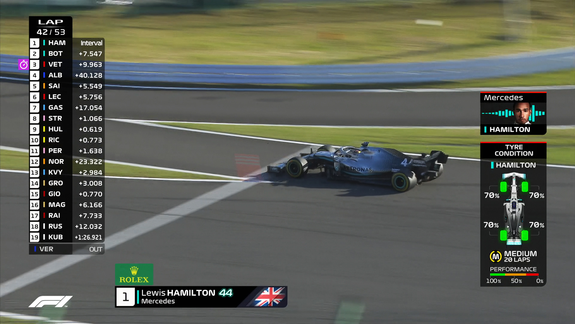
This was a graphic introduced in 2019 which was widely criticized by fans and even initially produced some confusion at Pirelli, the tire manufacturer for the sport. Part of the reason this graphic received so much criticism, is that tires are a very complicated part of the strategy to begin with. Pirelli themselves don’t always get the estimated tire lifetimes right, and the goal of a graphic like this is to accurately make such estimations. This lead to early displays that were clearly wrong. Most notably in the first race these graphics were used, Lewis Hamilton pitted because his tires were worn, and the graphic on screen had green tires with 70% left on them. This situation is interesting to me more because of the problem rather than the attempted solution.
Tire wear has many different factors, some of which are being taken into account for these graphics, at least according to this article. However, it’s still not clear what data is being used and when. Pirelli typically updates their recommendations after Friday practice when they receive sets of tires back from all the teams. It’s not clear if AWS uses this in their model, or really what data specifically is being used. A strict interpretation of the above article would mean this model essentially only uses what’s available to fans through the live timing app. I’m not entirely sure what this implies about the model or the quality of the data, and that’s part of the issue. There may be ways to overcome these obstacles that make this a viable setup; I’ll let you know when I’m further into the course.
As pointed out here, the biggest obstacle to making this an effective tool for learning more about the race isn’t necessarily how accurate the graphic is, but rather that from the outside it’s difficult to know how representative the whole thing is. Viewers shouldn’t need data science or machine learning experience to be able to get something meaningful from a graphic display during the live race. A few flubs, and even if the model has improved over the past few years (who knows?) it’s remained a widely derided part of the viewing experience. This lack of transparency is a quality of data science work I’m interested to know more about.
Where to go?
By contrast, this New York Times tool is much more open. The ‘About this project’ page includes brief sections on methodology and what sources they used for their data. This is already a step up. Users know what the tool is pulling data from, and if things look off, they can go investigate. This tool is also on the opinion page for a reason. The bias in the tool’s construction is acknowledged and understood in the context of the tool. Rather than designing something to draw objective conclusions from, the creators made something to satisfy curiosity and work with the subjective wants of the user to get results. Another good choice was including breakdowns of the overall match estimation. This lets users engage with the data more, and they can correct their selections if the ones they chose weighted their results in an unwanted way. I’m not someone who stares at location data all the time (yet), but this already feels more accessible to me than the tire graphics.
The location picker tool succeeds where the F1 diagrams fail by letting the audience understand some of the decision making, and by presenting the data with clarity but without over simplification. There may be more issues at hand with either project, but the transparency difference I find most interesting right now. I might find implementation ideas more appealing as I move through the course, but for right now my best understanding of the effectiveness of a visualization or a tool is as a user. Obviously my hope for moving forward is to gain understanding in different contexts, but working on clarity and communication seems to be quite important too.
Thanks for reading! Please feel free to leave a comment or suggestion, I’d appreciate the advice.